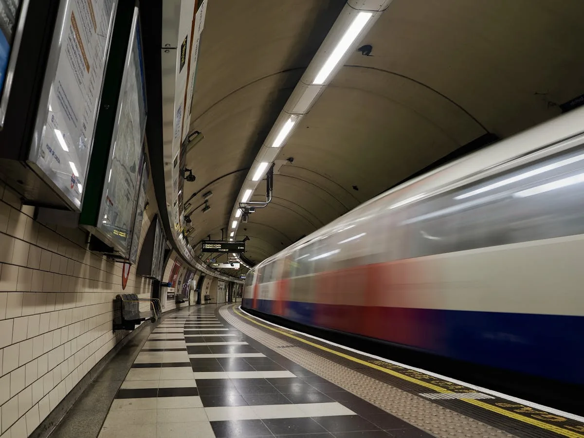
When people ask “how fast does the Tube go?”, they usually mean one of three things: top speed (the headline number you might briefly touch on a straight, uncongested stretch), average operating speed (how fast the trains actually move once you include braking, accelerating, and station stops), or door-to-door speed (what your commute feels like once you add the wait for a train, interchange time, and the inevitable moment someone tries to board after the beeps). Most arguments about speed happen because everyone is talking about a different one of these.
London’s network is engineered primarily for throughput - moving a lot of people reliably - rather than velocity. That design choice shows up everywhere: short station spacing in the centre, tight curves inherited from Victorian streets, and a signalling philosophy that prefers predictable braking margins over late braking into a platform. If you are new to the network entirely, our complete guide to using the London Underground covers everything from payments to etiquette.
TfL itself puts a hard ceiling on Underground train speed at 60 mph for safety reasons. That statement is true and also slightly misleading, because the number you experience depends on what the trains could do, what the line permits, and whether there is enough uninterrupted distance between stations to get anywhere near it. So let’s do this properly.
The four speeds that everyone confuses
Keep these separate and the rest of the story makes sense.
Design top speed
The maximum the rolling stock is designed to reach under ideal conditions. For older fleets, this can be surprisingly low: the Bakerloo’s 1972 stock is 45 mph.
Maximum permitted line speed
A speed limit set by curves, gradients, sighting, braking distance, and signalling. TfL withholds detailed line-speed information for security and safety reasons.
Peak speed in service
The fastest you actually hit on a real run with real station spacing, real dwell times, and real operational margins. Some lines reach their peak frequently; others rarely have enough runway.
Average speed (commercial speed)
The one that matters most: distance divided by total time, including station stops. This is what determines how long your commute takes.
London’s average speeds, ranked
TfL published timetable-based average speeds for 2022. These are line-wide averages, so they include slow central sections and faster outer stretches. They are the single most useful measure of how fast each line actually is.
Source: TfL timetable-based average speeds, January-December 2022. Includes station dwell time.
A few things jump out. The Metropolitan line wins not because it is a race car, but because it has long inter-station runs in the suburbs and fewer brutally tight central curves. The Circle line is slow because it is effectively a dense, central, stop-everywhere loop - it is doing exactly what it was built to do, just not quickly. Victoria and Jubilee do well because they combine relatively long gaps (in places), high-frequency service discipline, and modern control.
The hard cap: why 60 mph is basically “as fast as it gets”
For London Underground, the published maximum speed is 60 mph (about 97 km/h). That number is not there because engineers lack imagination. It is there because braking distance, headways, and safety margins get expensive quickly.
Using a representative service braking deceleration (around 1.1-1.2 m/s²), here is how stopping distance scales with speed:
| Speed | Approx. braking distance | Implication |
|---|---|---|
| 40 mph | ~140 m | Comfortable within most station spacings |
| 50 mph | ~219 m | Needs a reasonable clear run |
| 60 mph | ~316 m | Roughly 300 m just to stop |
| 70 mph | ~429 m | Exceeds many central station gaps |
At 60 mph, you need roughly 300 metres just to stop comfortably, before you even talk about reaction margins, degraded adhesion (wet rails, leaf mulch, and the charming unpredictability of British weather), or the fact that you are doing this inside a constrained tunnel with limited ways to route around trouble.
And here is the nasty trade-off: higher speed increases braking distance, which increases the spacing you need between trains, which can reduce capacity. TfL explicitly notes that lines do not run at maximum speed much of the time because doing so would reduce how many trains can be run. In other words, there is a reason the Tube feels like it is trying to win on frequency rather than raw speed. In Zone 1, it is.
Line by line: what “maximum” actually means in practice
TfL does not publish a full set of maximum speed profiles by line segment, and has said it will not release certain detailed performance information. What we can do is combine published rolling stock top speeds (from FOI responses) with the measured reality that average speeds are well below headline maxima.
Bakerloo
Train top speed: 45 mph (TfL FOI)Often below 45 mph in service because station gaps are short. TfL explicitly notes trains “can rarely build up to this speed before having to slow for the next station stop”. Ageing 1972 stock in narrow tunnels. Dependable but not quick.
Piccadilly
Train top speed: 55 mph | Line limit: 45 mph in placesThe train can do more than the infrastructure allows. Around 45 mph where the track permits, but much lower through the central core. New air-conditioned trains arriving from late 2026 should improve acceleration profiles.
Victoria
Fleet top speed: ~50 mph | Avg: 26.4 mphOne of the best averages in London. Engineered as a high-frequency metro with modern, repeatable driving profiles and comparatively simple routing. The Tube’s closest thing to a metronome - consistent, brisk, and emotionally indifferent to your comfort.
Jubilee
Avg: 25.1 mph | Often cited in “fastest” discussionsModern rolling stock and long inter-station gaps on parts of the route, especially away from the tight central geometry. One of the more plausible candidates to get near the network’s upper envelope.
Central
Outer areas line speed: 53 mph (FOI) | Avg: 23.2 mphLong straight bits that could support high speed, but also a job description that includes “carry London to work”. Higher on outer sections where spacing is generous, lower in the central core.
Northern
Avg: 21.2 mph | Varies wildly by branchBasically two railways pretending to be one. The core sections are station-dense and capacity-constrained, pushing operations toward frequent braking and conservative margins rather than sustained high speed.
Metropolitan
Fleet: S-stock (100 km/h design) | Avg: 27.4 mph - FASTESTHighest average speed on the network. Long runs in the outer sections give trains time to accelerate, cruise, and not spend half their life braking. The geometry and operating pattern simply give it more runway.
Circle
Fleet: S-stock (100 km/h design) | Avg: 15.1 mph - SLOWESTSame trains as the Metropolitan, designed for 62 mph. The infrastructure is not interested. Dense stops, lots of interactions with other services, and a geometry that was never built for speed.
The key point across all lines: train capability is not the bottleneck. The bottleneck is stop spacing, junctions, and the need to run a stable timetable in a network where one tiny delay can propagate like gossip.
Station spacing: the physics of why average speeds are low
If you have 400-600 metres between stations, high top speed is mostly a marketing number. You spend the run accelerating, then braking, with a brief moment of “cruise” that is too short to matter.
Here is a simplified model: assume a speed cap of 60 mph, strong metro-style acceleration and braking (around 1.3 m/s² accelerating and 1.1-1.2 m/s² braking), and a 30-second dwell time (optimistic at busy central stations, realistic off-peak).
| Station spacing | Run time (no dwell) | Total incl. 30s dwell | Implied average speed |
|---|---|---|---|
| 500 m | ~41 s | ~71 s | 25.5 km/h (15.8 mph) |
| 800 m | ~52 s | ~82 s | 35.2 km/h (21.8 mph) |
| 1,000 m | ~59 s | ~89 s | 40.3 km/h (25.0 mph) |
Two important observations. First, station spacing dominates average speed. If you build a metro with stops every 500-700 metres (classic inner London), you can have excellent trains and still end up with modest average speeds. Second, top speed has diminishing returns when stops are frequent. On an 800 m spacing, pushing the cap from 60 mph to 70 mph saves well under a second, because the train barely has time to cruise before it must brake again. The real gains come from acceleration, braking consistency, and dwell time - not from chasing a higher headline speed. To see how line speeds translate to actual journey times, try our travel time map - click any station to see how long it takes to reach every other stop.
The honest answer: you would gain less time than you think, and you would pay for it in capacity, wear, energy, and safety case complexity. At typical central London station spacings, pushing top speed from 60 to 80 mph saves less time than shaving 5 seconds off dwell.
Why the Tube is not faster in practice
1. Curves, junctions, and inherited geometry
A lot of deep-tube alignment is a negotiation between Victorian property lines, clay, and “please do not undermine that important building”. Tight curves impose speed limits for comfort, wheel-rail forces, and noise. Even if a train can do 60 mph, it cannot do 60 mph everywhere without turning passengers into a sort of human metronome.
2. Dwell time is the silent assassin
The biggest speed constraint in central London is often not the tunnel. It is the platform. If dwell creeps from 30 seconds to 45 seconds at a busy station, you lose more time than you would gain by raising the top speed by 10 mph. Automation can make driving smoother, but it cannot stop people holding doors for their mate who is “literally just there”.
3. Capacity beats bragging rights
TfL is explicit that maximum speed is not the usual operating point, partly because higher speed can reduce how many trains the signalling system can safely accommodate. On a metro, the “fastest” network is often the one that keeps headways tight and consistent, not the one that occasionally hits a big number in a tunnel. And frequently the bottleneck is not the running section at all - it is how quickly trains can turn around at each end.
4. Power and heat
Higher speed means higher power demand during acceleration and more energy to dump during braking. Some of that energy can be recovered via regeneration, but the limiting factor in deep tunnels is often heat management, not theoretical motor power.
5. Maintenance cost scales sharply with speed
Track wear, wheel wear, and dynamic forces scale unpleasantly as you push speeds up, especially in a mixed-geometry network. A metro that targets 120 km/h as a normal operating speed is effectively choosing a different maintenance regime and, often, different alignment standards.
Automation: making things quicker without going “faster”
Automation in metros is often misunderstood. Its biggest win is not top speed - it is consistency.
The Paris Metro reports a maximum permitted speed of 70 km/h, but its automated lines are the fastest by commercial speed, with Line 14 particularly high. That tells you what automation buys: tighter station approaches, repeatable braking, fewer “human variability” margins, and better recovery from disruption.
In London terms, automation and modern control tend to improve headway stability (more trains per hour without meltdown), station re-acceleration discipline (less variance between drivers and between runs), and energy management (smoother traction and braking profiles). It does not magically turn the Tube into a high-speed railway. If anything, the more you optimise for capacity and reliability, the more you end up choosing conservative speeds that keep the service even. For more on this, see our full guide to Tube automation.
London has been migrating towards modern metro signalling for decades. Modern metros increasingly use CBTC (Communications-Based Train Control), which enables tighter, dynamically managed separation between trains than traditional fixed-block signalling. The UK’s Competition and Markets Authority notes that resignalling London Underground is unusually complex compared with many other metros - which is one reason “just automate it” is never just.
New trains bring faster acceleration, more reliable braking, better door layouts, and energy efficiency (including regenerative braking). TfL awarded a contract to Siemens for new Piccadilly line trains, intended to improve capacity, reliability, and accessibility. But trains are only half the story. Without matching signalling upgrades and station management, you end up with very nice trains queueing politely behind 1970s constraints.
Safety: the reason the Tube is allowed to exist at all
Speed is a performance metric. Safety is the licence to operate. London’s safety culture has been shaped by hard lessons.
- King’s Cross fire (1987) led to major changes in station fire safety, escalator management, and operational practices. It is frequently cited as a turning point in Underground safety standards.
- Moorgate crash (1975) triggered a detailed investigation and subsequent safety responses around train protection and terminal overrun risks.
- After the 7 July 2005 attacks, practical weaknesses in underground communication drove improved radio coverage and interoperability for emergency services.
TfL’s FOI response on energy and speed data provides average line speeds but refuses to release acceleration and braking times and distances, citing national security and health and safety exemptions. That tells you something important: the constraint is not simply “stronger motors” - it is the entire safety envelope.
If you ever wonder why a train slows for what looks like no reason, remember that every “no reason” has probably been somebody’s incident report.
London vs the world: how metros compare
A useful way to compare cities is to separate top speed (engineering capability) from commercial speed (what the timetable delivers). Older systems with tight station spacing tend to have similar commercial speeds even if their trains are wildly different.
| City (system) | Top speed | Published average speed | Notes |
|---|---|---|---|
| London (Underground) | 60 mph (97 km/h) | 15-27 mph by line | Constrained by geometry, dense stops |
| Paris (legacy Metro) | 70 km/h (43 mph) | ~21 km/h (13 mph) | Dense stops drive the average down |
| Paris (Grand Paris Express) | 110 km/h | 55-65 km/h | New geometry, wider spacing |
| New York (Subway) | 55 mph (88 km/h) | 17.4 mph | Huge complexity, mixed infrastructure |
| Moscow (Metro) | 100 km/h | ~39.5 km/h (24.6 mph) | High frequency is a priority |
| Tokyo (Metro) | up to 100 km/h | ~30 km/h (18.6 mph) | High demand, frequent stops |
| Seoul (Subway) | 80 km/h | ~33.7 km/h (20.9 mph) | Strong performance, big network |
| Copenhagen (Metro) | 80 km/h | ~40 km/h (24.9 mph) | Driverless, designed from scratch |
| Vancouver (SkyTrain) | 80 km/h | ~45 km/h (28 mph) | Automated rapid transit |
| Shanghai (Metro) | 80-120 km/h | varies by line | Large-scale GoA4 on several lines |
| Dubai (Metro) | ~95 km/h | varies | Driverless, platform screen doors |
A few patterns emerge. Legacy dense metros (London, Paris, New York) are constrained by geometry and stops. They can modernise signalling and fleets, but they cannot change the fact that stations are close together without rebuilding half the city. Newer automated metros (Copenhagen, Vancouver, Dubai) often have longer station spacing, straighter alignments, and platform screen doors designed in from day one - making higher commercial speeds easier to achieve. Automation correlates strongly with higher commercial speed, not because the trains are faster in absolute terms, but because the whole operation is tighter.
London is an odd hybrid: its best line averages (Metropolitan, Victoria, Jubilee) are competitive with modern systems, but it is carrying that performance through infrastructure that is older and more geometrically constrained than most peers. The Elizabeth line, built to modern standards, shows what happens when you start fresh - its Class 345 trains reach 62 mph in the central tunnel section and up to 90 mph on the outer Network Rail stretches to Shenfield and Reading, with an end-to-end average comfortably faster than any Underground line.
Whether you are interested in the engineering or just trying to get to work on time, knowing about disruptions before you leave home is half the battle. A delayed journey wastes time regardless of how fast the train could theoretically go. You can check the live line status at any time.
We built Tube Notifications to solve this. Choose the lines you use, set the time window that matters, and get an email when something goes wrong - before you head out, not after you are stuck underground. No app, no account, takes 30 seconds, and it is completely free.
Set up a free alert →- Maximum speed: about 60 mph. But this is a safety ceiling, not a typical operating speed.
- Line averages: 15-27 mph. Metropolitan (27.4 mph) is fastest, Circle (15.1 mph) is slowest.
- Station spacing dominates speed. With 500 m between stops, even a 100 mph train averages under 16 mph.
- The Tube is optimised for throughput, not velocity. Higher speed can actually reduce capacity.
- Automation helps more than raw speed. Consistent operation, tighter headways, and smoother driving beat a bigger speedometer.
- London’s best lines are globally competitive despite infrastructure that is older than most peer systems.
- Set up a free delay alert - a disrupted journey wastes more time than a slow one.
London’s best-performing lines are not “fast” because they hit astonishing maxima; they are fast because they keep moving, keep spacing consistent, and avoid long dwells. The fastest Tube is usually a boring Tube - one where nothing dramatic happens at all.
Or, put less nobly: it is hard to go 60 mph when you have to stop again in 35 seconds, and the tunnel bends like it was designed by someone drawing with their elbow.
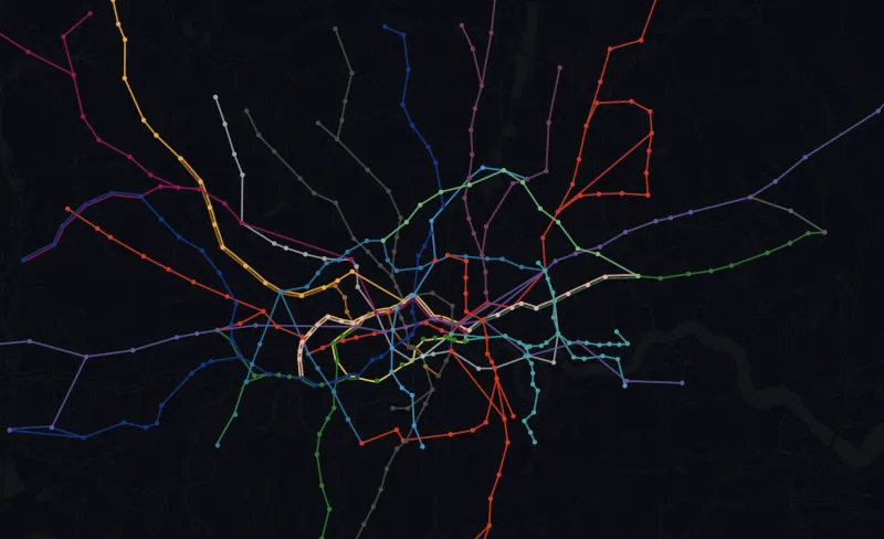
Speed data from TfL timetable-based average speeds (2022). Rolling stock top speeds from TfL FOI responses. Braking distances are simplified estimates using representative service braking deceleration rates. Global metro data from published operator figures and transport authority reports. The Tube map is useful for understanding connections, but remember it is not geographically accurate - two stations that look far apart might be a three-minute walk.
We build highly customisable tube alerts for the London Underground, Overground, DLR and Elizabeth line. Whether you are a daily commuter or a tourist visiting for a week, choose the lines you will be using, set a time window, and we will only email you when something actually goes wrong. Free, no app required, and takes 30 seconds.
Set up a free alert →
When Will the Tube Be Fully Automated?
CBTC, driverless operation, what is actually planned, and why “just automate it” is never simple.
Why Is the Tube So Hot?
Platform temperature data, the physics of tunnel heat, and what TfL is actually doing about it.
How Deep Is the Tube?
Depth data for every station, the deepest platforms, and why some lines run so far underground.
Travel Time Map
Click any station to see journey times everywhere. Toggle lines off to simulate disruptions.