Harry Beck was a 29-year-old engineering draughtsman at the London Underground Signals Office when he sketched a radical idea in 1931: throw away geography and show connections instead. His bosses rejected it as “too revolutionary”. A year later they relented, printed 700,000 copies, and created one of the most influential pieces of graphic design in history. Every metro map in the world - from Tokyo to New York - now copies his approach.
The map has changed a lot since then. The 2026 version shows far more than the Underground: six named Overground lines with their own colours, the Elizabeth line, DLR, Tramlink, Thameslink, and even the cable car across the Thames. But the core design rules are still Beck’s: horizontal, vertical, and 45-degree lines only, distances be damned.
If you are new to London entirely, start with our complete guide to using the London Underground - it covers payments, etiquette, navigation, and everything a newcomer needs. This page focuses specifically on the map itself.
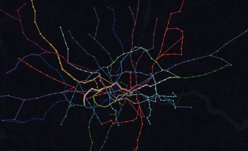
The current Tube map
This is the standard TfL Tube and rail map. You can scroll and zoom within the viewer, or download the PDF to keep on your phone for offline use.
The PDF works well saved to your phone’s files for offline use underground - useful when you have no signal on deep-level platforms.
How to read it: the symbols that matter
The map looks dense at first glance, but you only need to recognise a handful of symbols to use it confidently.
White circle - a regular station on a single line. Most of the map is these.
Interchange - where two or more lines meet. You can change trains here without leaving the station (or via a short walk).
Step-free - the blue wheelchair symbol means step-free access from street to platform. Around 95 stations have this.
Zone boundary - the grey lines crossing routes. Which zones you cross determines your fare.
National Rail interchange - you can connect to mainline train services here. Useful for airports and journeys beyond London.
The Thames - the one geographic anchor Beck kept. If you can see the river, you know roughly where you are: north or south.
Some lines split into branches, and this is where the map trips up beginners. The Northern line is the worst offender - it splits in both the north and south. If you board the wrong branch, you end up on an unplanned tour. Always check the electronic display on the platform and the front of the train before boarding.
Think you know where the stations actually are? Mind the Map gives you a station name and asks you to pin it on a real map - no diagram distortion to help you. The closer you get, the more points you score.
Play Mind the Map →What the map hides: distance, walking shortcuts, and geography
The single most important thing to understand about the Tube map is that it is not to scale. Zone 1 is deliberately enlarged so you can read the station names. Outer zones are compressed. This means two stations that look far apart in central London might be a three-minute walk, while two stations that look close together in Zone 5 might be miles apart.
Some of the worst offenders:
TfL publishes a walking-between-stations map (listed below) that shows walk times between adjacent stations in Zones 1-3. It is genuinely useful - many central journeys are faster on foot than waiting for a train, changing, and tapping through barriers.
If you want to skip the Tube entirely for short trips, hire bikes are often faster across central London, especially in good weather.
What is on the 2026 map
The map has grown far beyond the original 11 Underground lines. Here is everything shown on the current version:
- 11 Underground lines - the core Tube network, 272 stations, 250 miles of track
- 6 named London Overground lines - Lioness, Mildmay, Windrush, Weaver, Suffragette, and Liberty. These replaced the old single-colour “Overground” in 2024, each with its own colour and name
- Elizabeth line - London’s newest railway, 41 stations from Reading and Heathrow through central London to Shenfield and Abbey Wood
- DLR - shown as dashed lines, covering east and south-east London including London City Airport, Canary Wharf, and Greenwich
- Thameslink - the cross-London rail service connecting Bedford and Brighton through central London
- Tramlink - tram services in south London, mostly around Croydon
- Emirates Air Line - the cable car between the Greenwich Peninsula and the Royal Docks
The 400+ stations now shown on the map can feel overwhelming, but most visitors only need to focus on the thick coloured lines - those are the Underground and Overground routes that form the backbone of daily travel.
Every version of the map TfL publishes
The standard Tube map above is the most common, but TfL publishes several specialist versions. All are free PDFs.
Standard Tube Map
The classic pocket map. Updated several times a year. The one embedded on this page.
Large Print Map
Available in colour and black-and-white. Easier to read for anyone who finds the standard map too small.
Step-Free Access Map
Marks every station with step-free access from street to platform. Essential if you use a wheelchair, have heavy luggage, or travel with a pushchair. We also offer free lift status alerts for step-free stations.
Night Tube Map
Shows the five lines that run all night on Fridays and Saturdays: Victoria, Central, Jubilee, Northern, and Piccadilly.
Walking Between Stations Map
Walk times between adjacent stations in Zones 1-3. Reveals how many “journeys” are faster on foot.
Bus Spider Maps
Area-specific maps showing bus routes radiating from a central point. Available for each part of London.
All of these can be downloaded from tfl.gov.uk/maps. The TfL Go app also has an interactive map with step-free filtering and live service status built in.
Journey planning: the map is just the start
The map tells you which lines connect where, but it will not tell you the fastest route, the cheapest fare, or whether the Northern line is currently suspended. For that, you need a planner.
- TfL Journey Planner (tfl.gov.uk) - the official tool. Reliable for disruptions and step-free routing.
- Google Maps / Apple Maps - good for door-to-door directions that mix walking, buses, and Tube.
- Citymapper - popular with Londoners for step-by-step directions and real-time departure boards.
- Interactive travel time map - click any station to see journey times everywhere. Toggle lines on and off to see how disruptions would change your route.
For day-to-day commuting, it also helps to have delay alerts set up for the lines you use - knowing about a disruption before you leave home can save you a wasted journey. You can also check the live line status on our site at any time.
A brief history of Beck’s design
Before Beck, London Underground maps tried to be geographically accurate. The result was a mess - central stations were crammed together while outer stations spread across vast empty space. Passengers found them confusing.
Beck’s insight was simple: underground passengers do not need to know where they are geographically. They need to know how to get from A to B - which line, which direction, where to change. So he threw out geography and imposed three rules: lines run only horizontally, vertically, or at 45-degree diagonals. Stations are evenly spaced. The Thames is the single geographic anchor.
He was paid around 10 guineas for the work. Today, every underground system in the world uses his approach - though London’s remains the original and, arguably, the most elegant. Since 2001, every edition of the map carries the credit: “This diagram is an evolution of the original design conceived in 1931 by Harry Beck.”
The map shows you where to go. We tell you when something goes wrong before you get there. Choose the lines you use, set the time window that matters, and get an email when there is a disruption - before you leave home. No app, no account, 30 seconds to set up, completely free.
Set up a free alert →- The Tube map is not geographically accurate. It shows connections, not distances. Zone 1 is enlarged; outer zones are compressed.
- Check walking distances in central London. Many adjacent stations are under 5 minutes apart on foot - often faster than taking the train.
- The 2026 map shows 400+ stations across Underground, six Overground lines, Elizabeth line, DLR, Thameslink, and Tramlink.
- Download the PDF for offline use. Signal underground is improving but not universal - having the map saved on your phone is still useful.
- Use a journey planner for routing. The map shows connections; TfL Journey Planner, Google Maps, or Citymapper give you the actual best route.
- Set up a free delay alert to know about disruptions before you travel, not after.
- TfL Maps - all official Tube and rail maps
- TfL - Harry Beck’s Tube Map - history and design evolution
- London Transport Museum - transforming the Tube map
We build highly customisable tube alerts for the London Underground, Overground, DLR, and Elizabeth line. Whether you are a daily commuter or a tourist visiting for a week, choose the lines you will be using, set a time window, and we will only email you when something actually goes wrong. Free, no app required, and takes 30 seconds.
Set up a free alert →
How to Use the London Underground
The complete 2026 guide - payments, etiquette, navigation, Night Tube, airports, and everything else.
Tube Fares in 2026
Full fare tables, March 2026 changes, caps, discounts, pink readers, and the tapping mistakes that cost you money.
How Deep Is the Tube?
Platform depths for every station, the deepest lines, and what London’s geology reveals.
Travel Time Map
Click any station to see journey times everywhere. Toggle lines off to simulate disruptions.
TfL updates the Tube map several times a year. We update this page when new versions are published. Let us know if you spot something out of date.